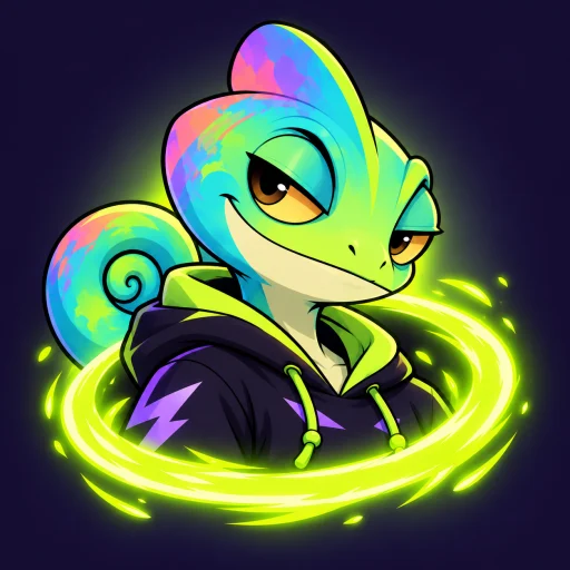
Hidewild
Real-life hide and seek on iPhone: draw a zone over a park, friends join with a code, and the game plays out on real streets.
- Pre-launch. In iPhone beta, as its own site says.
- September 2026
- iPhone game and live-match backend
What it is
Hidewild turns a park, a campus or a few blocks into an arena. One person draws the zone on a map, everyone joins with a code or a QR, and then the match runs on real streets: hiders get three minutes, seekers stare at a blacked-out screen, and in some modes the zone keeps closing in until standing still stops working.
It's a phone game where the hard parts aren't on the phone. A park full of players, each on a different network and a different phone, all have to agree on one clock — and none of them can be allowed to see where the others are.
Hidewild is in pre-launch beta and has no App Store listing yet, so there are no players, downloads or reviews to report.
The product itself
Captured from a build of the app, not mocked up for this page.
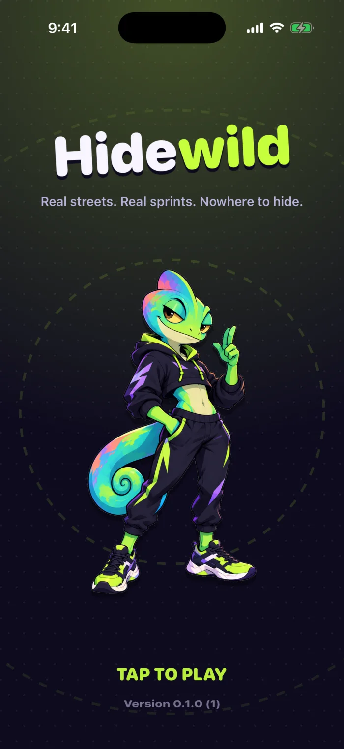
The title screen, and the closest thing the game has to a lockup: the wordmark is set, not drawn. 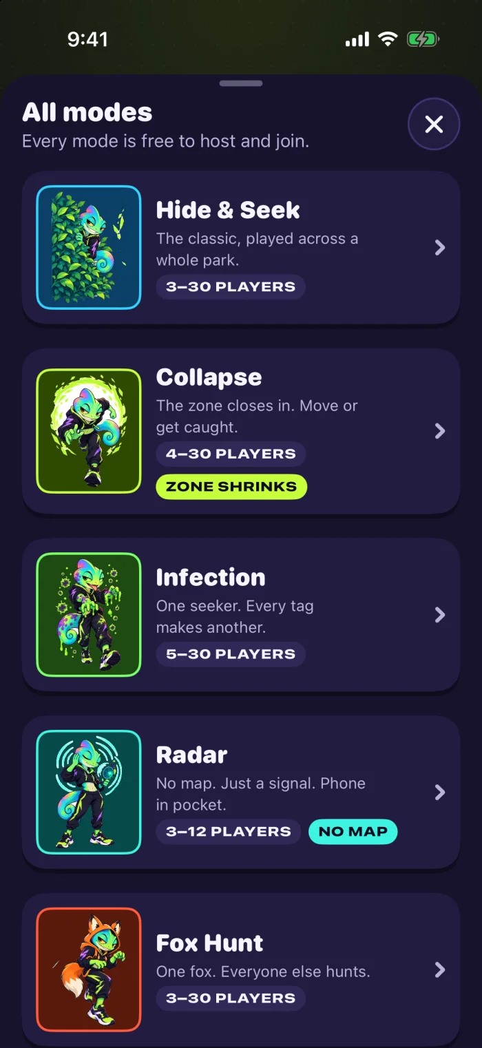
Five modes, each with its own colour and player range. Every one is free to host and join. 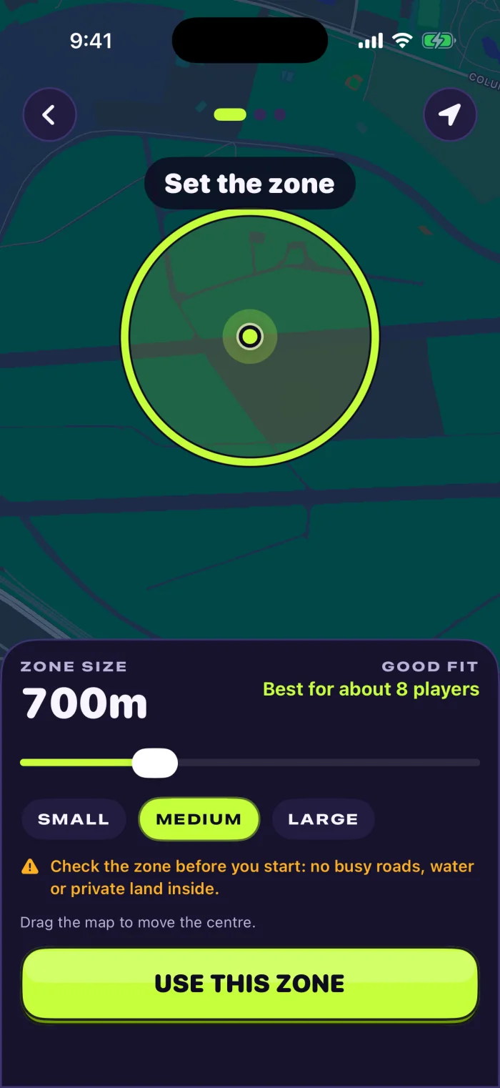
Drawing the zone. It suggests a size for the number of players, and tells the host to check for roads, water and private land first. 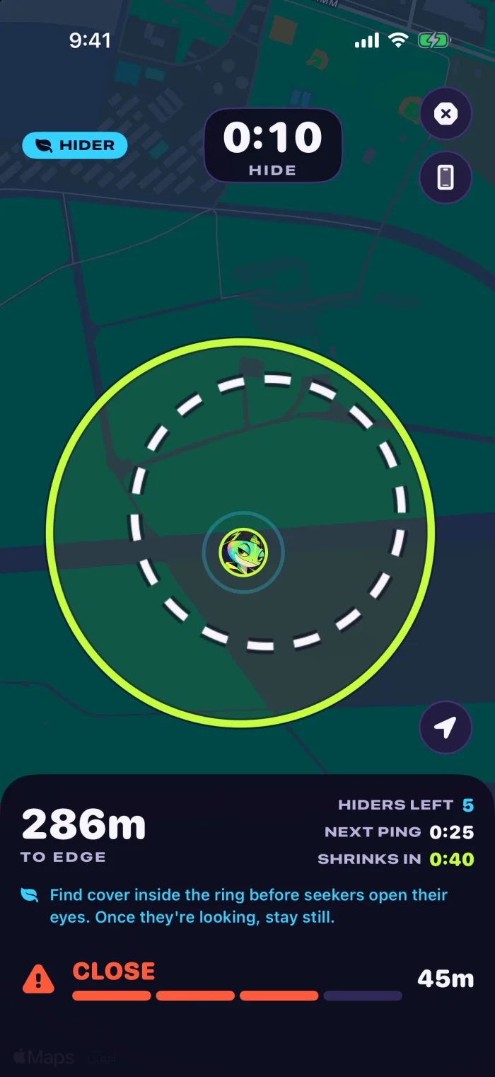
The hide phase. The next zone is already drawn inside the current one, so you can see where you'll have to be. 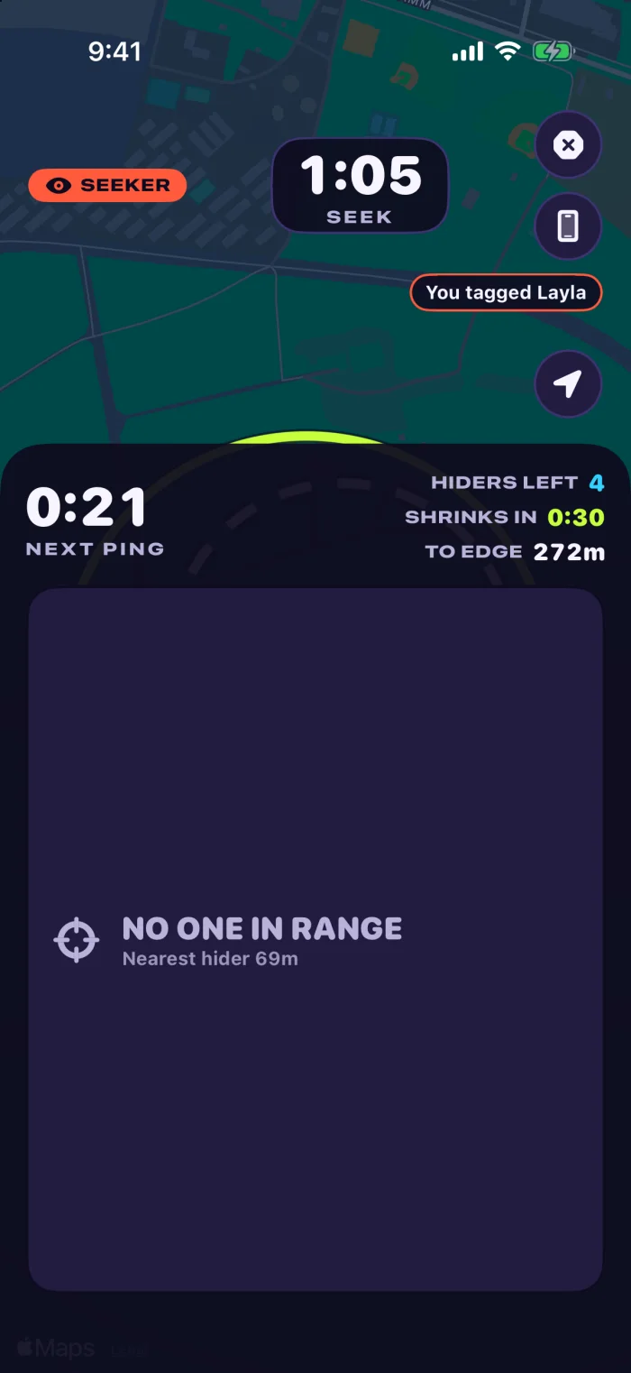
Seeking. The clock, the next ping and the next shrink all come from the server, so every phone in the park agrees on them. 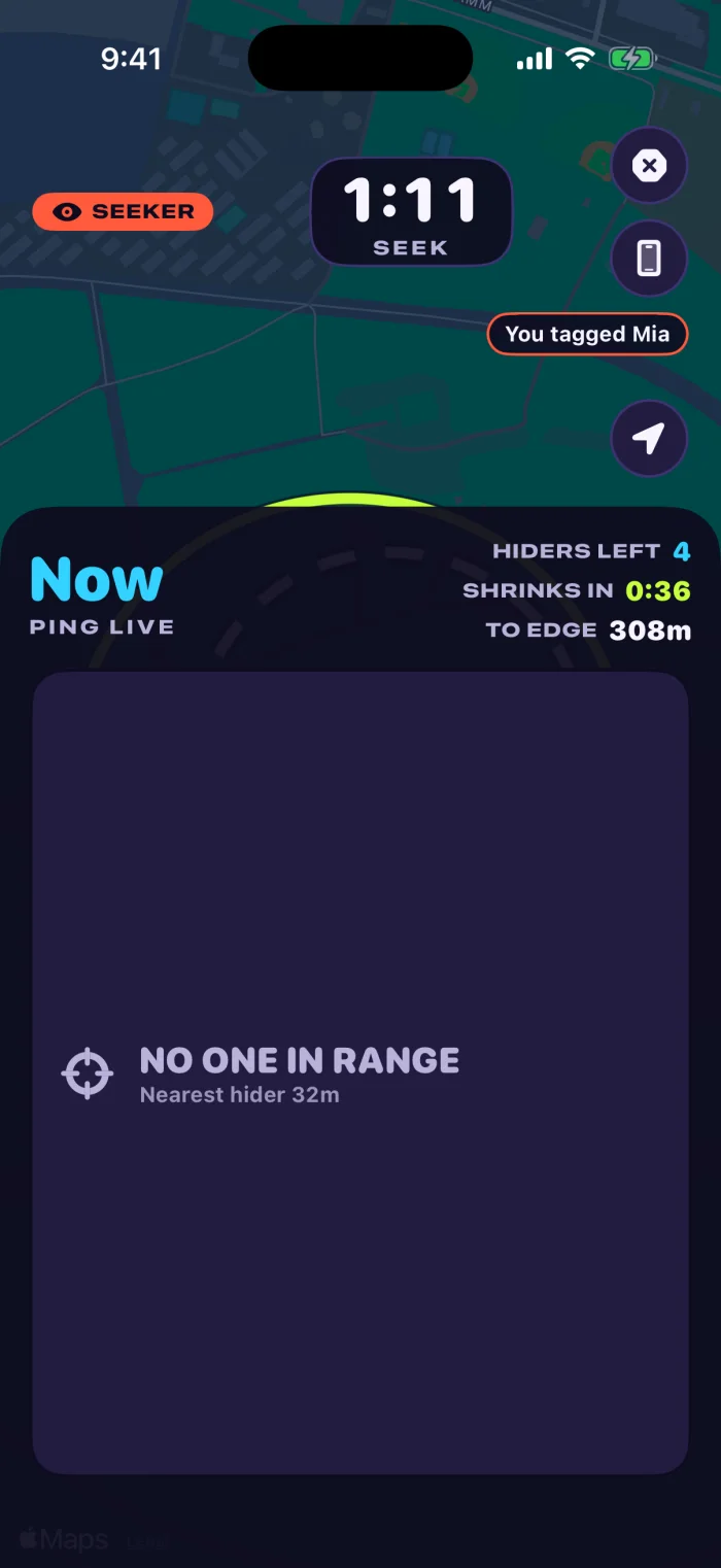
A ping goes live: for that moment, every hider is on the map. The feed behind it shows a tag that has already landed — settled in a transaction, so it counts exactly once. 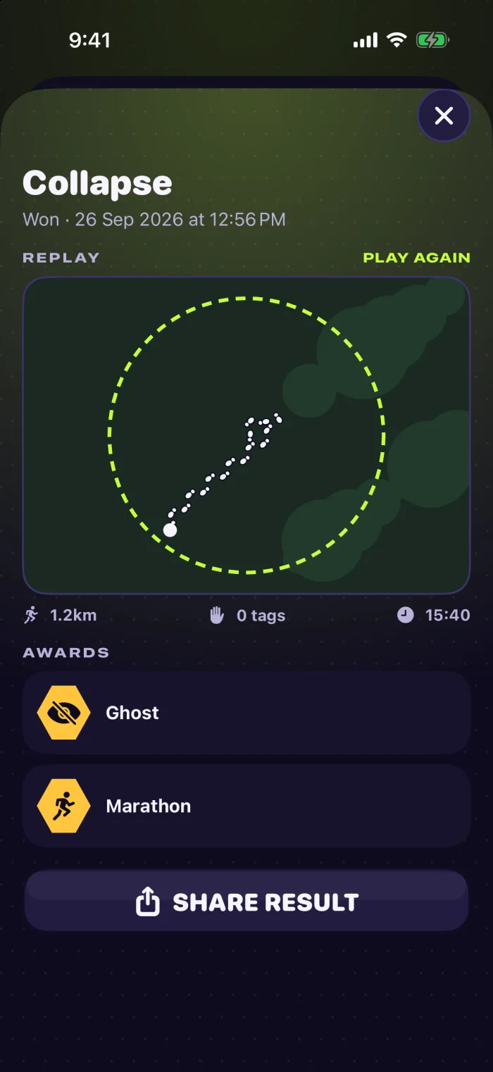
The replay, kept on the device: your own trail through the match, and the result you can share.
Hidewild's character art — the mascot, the avatars and the mode tiles — was generated with an AI image model. The interface around it is SwiftUI, drawn from the tokens above, and the screens on this page are captures of it.
What shipped
A match clock the server owns
The whole timeline — hide phase, seek phase, pings, zone shrinks — is written by the server when the match starts, and every phone derives its own clock from it. Tags, eliminations and the end of a match are settled in database transactions, so a timed event happens exactly once no matter which phone asks first.
Locations private by rule
Each player's phone writes only its own position, and the database rules let nobody else read it. Another player sees you only when the mode reveals you. Going dark for 90 seconds during the seek phase counts as leaving the zone, which closes the obvious way to cheat.
Five modes
Hide and seek, collapse with its shrinking zone, infection where every tag recruits a seeker, radar with no map at all, and fox hunt. Plus an event mode where a game master runs the match instead of playing it.
Replays and share cards
The last ten matches are kept on the device with every player's trail, replayable from the profile and exportable as a rendered card or video drawn over the real map.
Purchases verified on the server
Gem packs, a season pass, a starter pack and subscriptions. The app sends Apple's signed transaction, the server verifies it and credits it once, and App Store notifications handle renewals and refunds.
Four languages, including right to left
English, German, Spanish and Arabic, with every string behind a key. A pseudo-language and a screenshot matrix run in the quality gate, so a layout that breaks in Arabic fails the build rather than a review.
The design language
Dark first, because the game is played at dusk and the screen has to stay readable outdoors at a run. One high-visibility green carries every action, and the rest of the palette is rationed: a colour is spent only where it means something. These are the app's own tokens, taken from its theme file, not sampled from a screenshot.
Ink 900
The background everything sits on.
Ink 800
Raised surfaces.
Ink 700
Cards and control fills.
Line
Borders, at one weight.
Paper
Primary text on ink.
Mist
Secondary text, and common items.
Volt
Act now: host, join, tag.
Blaze
Seekers.
Tide
Hiders.
Prism
Anything paid for.
Gold
Anything earned.
Danger
Out of the zone, caught, destructive.
- A hard 4px offset in the fill's own darker variant. No blur, no glass. Buttons and tappable tiles carry it; panels and read-only cards sit flat.
- 1px at 60% opacity, one weight everywhere, so a screen of cards doesn't become a screen of frames.
- 12, 20 and 28px, with chips and pills fully rounded.
- A 4px scale up to 48, on an 18px gutter.
- Springs, tuned per job: snappy for controls, softer for panels, a heavy one for a slam. Reduce Motion stops every repeating animation.
Typography
All system faces, so Dynamic Type scales them: SF Pro Rounded Black for anything shouted, SF Pro Heavy for uppercase labels, monospaced digits for the match clock and any number that changes, and SF Pro regular for body text.
Principles
- A hard shadow means it can be pressed
- One colour means one thing, in every mode
- One outline weight: rarity changes its colour, not its thickness
The rule, shown rather than described: the three fills below are pressable, so each one sits on a hard shadow in its own darker shade. The panel beside them is only there to be read, so it sits flat.
How it got here
The changes that shaped the design, in the order they happened. Each one is a decision that left a mark on the product.
The name went first, before a screen was drawn
The game was going to be called Zonefall. A morning of checks killed it: another real-world location game had already launched under that name, an unrelated app owned the App Store search term for it, the handle was taken on four networks, and the word read as a mash-up of two shooters whose owners defend their marks hard. Hidewild was chosen the same day. Cheaper to lose a name in the morning than a trademark later.
Three animals went up, one came back
The mascot was explored as three characters in the same streetwear: a chameleon, a raccoon and a fox. The chameleon won on meaning rather than looks — it's the animal that hides in plain sight, which is the whole game — and became Wilder. The raccoon read as mischief and the fox as a hunter, which would have argued with a game where most players are hiding. Wilder guides the player and is never a player's own character.
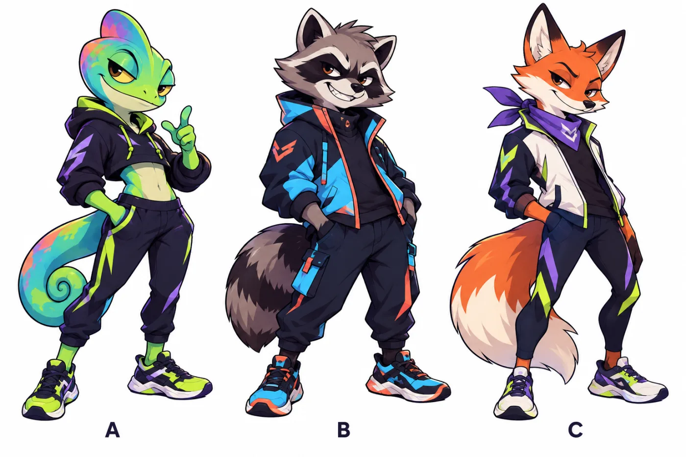
The exploration: A, B and C, drawn in one style so the choice was about character, not rendering. 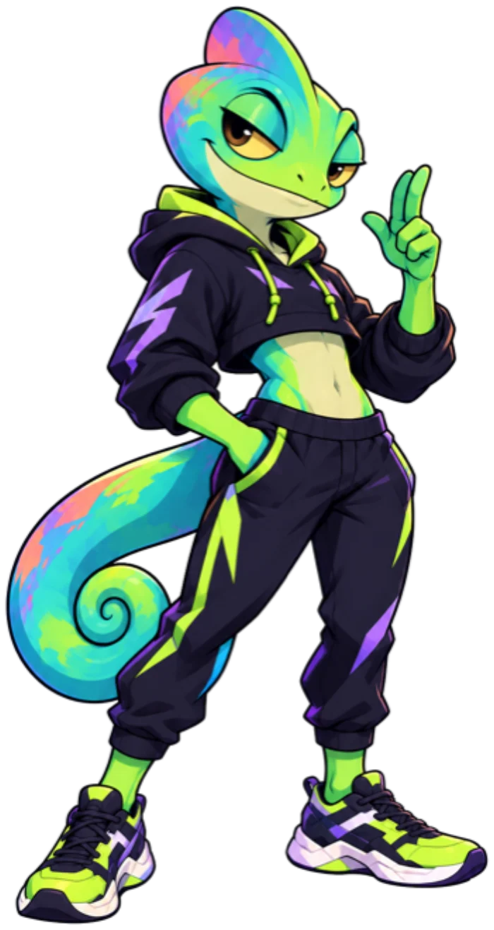
Wilder, as shipped: option A, with the palette tightened to the app's own colours.
Hidewild's character art — the mascot, the avatars and the mode tiles — was generated with an AI image model. The interface around it is SwiftUI, drawn from the tokens above, and the screens on this page are captures of it.
The player system got smaller on purpose
Players were designed to be assembled from parts — a two-tone body, a visor for the face, gear, a trail, a tag effect — so any combination of cosmetics would render cleanly at any size. What's built is one drawn avatar shown in a ring. The design documents were rewritten to say so rather than describe a system that didn't exist, naming the open choice: commission the parts, or keep whole avatars and drop the slots from the locker. A first version that ships beats a character pipeline that doesn't.
Colour came back out of the furniture
The first palette put a role colour on almost everything, navigation included. The pass that followed rationed it: role colours only where a role is actually meant — the match, the lobby teams, the results banner — purple reserved for anything paid for, gold for anything earned. Join, tabs, pills and Share went back to plain ink and paper. A screen wearing five accent colours tells you nothing about where to press.
Depth was given a job
The hard offset shadow started as a look and became a rule: it means the thing can be pressed. Panels and read-only cards lost it. Disabled controls stopped being faded buttons and got a style of their own. Outlines collapsed to one weight, with rarity carried in colour instead of thickness. And coins are drawn as coins — a stamped gold disc, never a lightning bolt, because that mark already means a tag effect.
The design outran its own screenshots
Rebuilding the match screen for a launch video from the marketing screenshot produced the wrong thing: a stop button the app no longer has, and players drawn as plain dots instead of their avatar portraits. The screenshot was days old. The scene was rebuilt from the app's source instead — which is also why the palette on this page is read out of the theme file rather than picked off a picture of it.
The calls behind it
The phones never trust each other.
Twenty players on twenty networks will disagree about the time, and one of them can always be a modified client. Anything that decides the game — the clock, a tag, an elimination — happens on the server.
Privacy is enforced by the database, not by the app.
A game built on live location has exactly one unacceptable failure. Writing the rule into the database means a bug in a screen can't turn into a player being tracked.
The match survives a locked phone.
Nobody plays hide and seek staring at a screen. Background location and a Live Activity on the Lock Screen and Dynamic Island keep you in the match with the phone in your pocket.
What it's made of
- Swift and SwiftUI, iOS 17+, project generated with XcodeGen
- WidgetKit Live Activity, background location
- Firebase: Cloud Functions in TypeScript on Node 22, Firestore, Realtime Database, Auth, Cloud Messaging
- StoreKit 2 with server-side verification and App Store Server Notifications
- One script: reference scan, string generation, unit and UI tests on two simulators, backend emulator tests
Built in-house by MVP Ninja. The same team, the same way of working, and the same mobile applications work we do for founders.